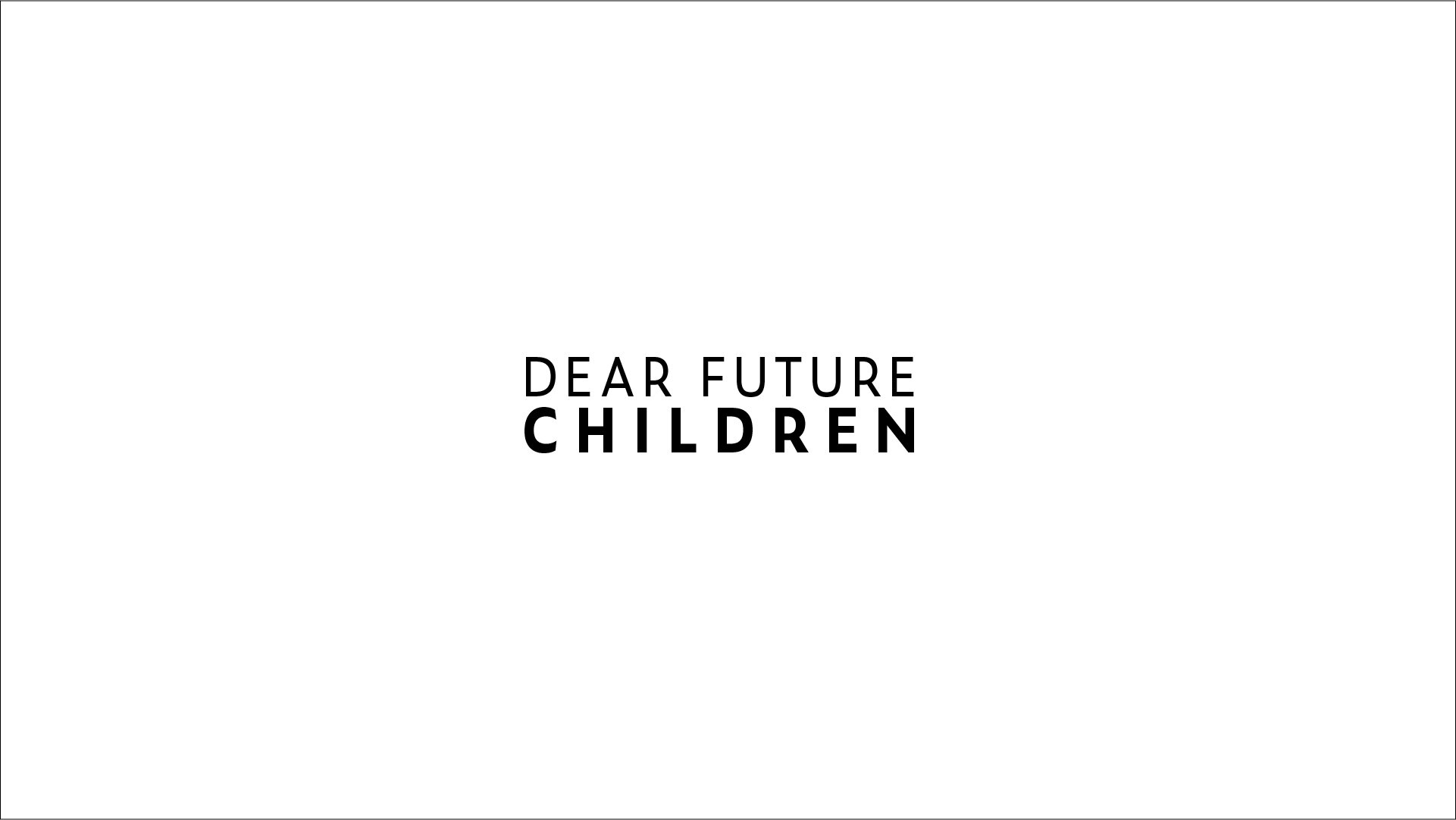
Dear Future Children
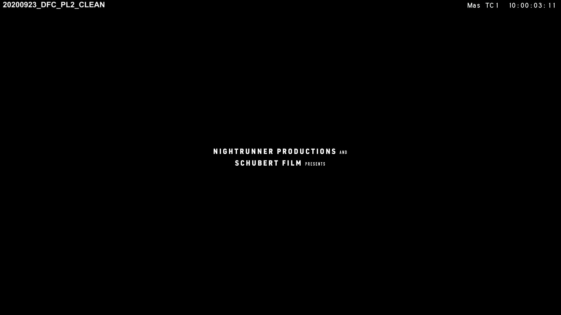
Title Design + Opening Credits & End Credits + On-Screen Graphics
2020, November
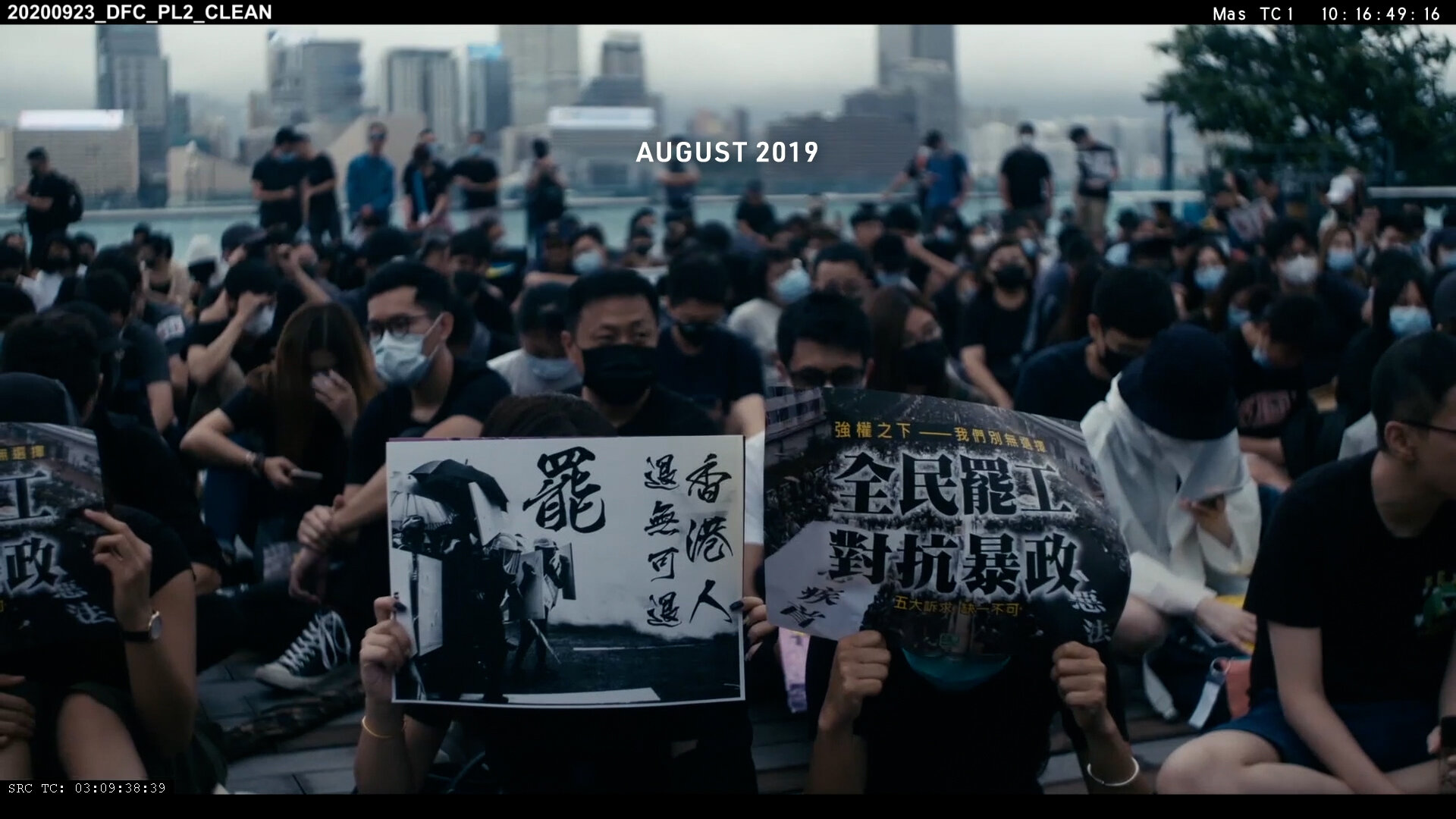
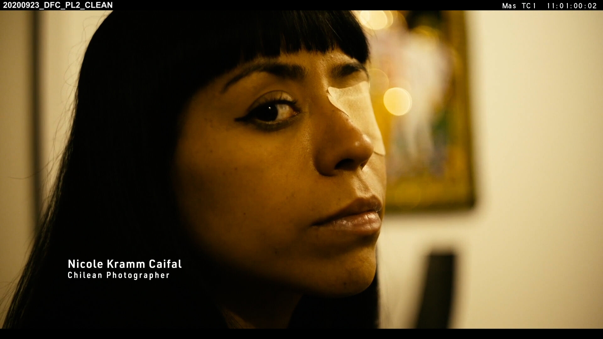
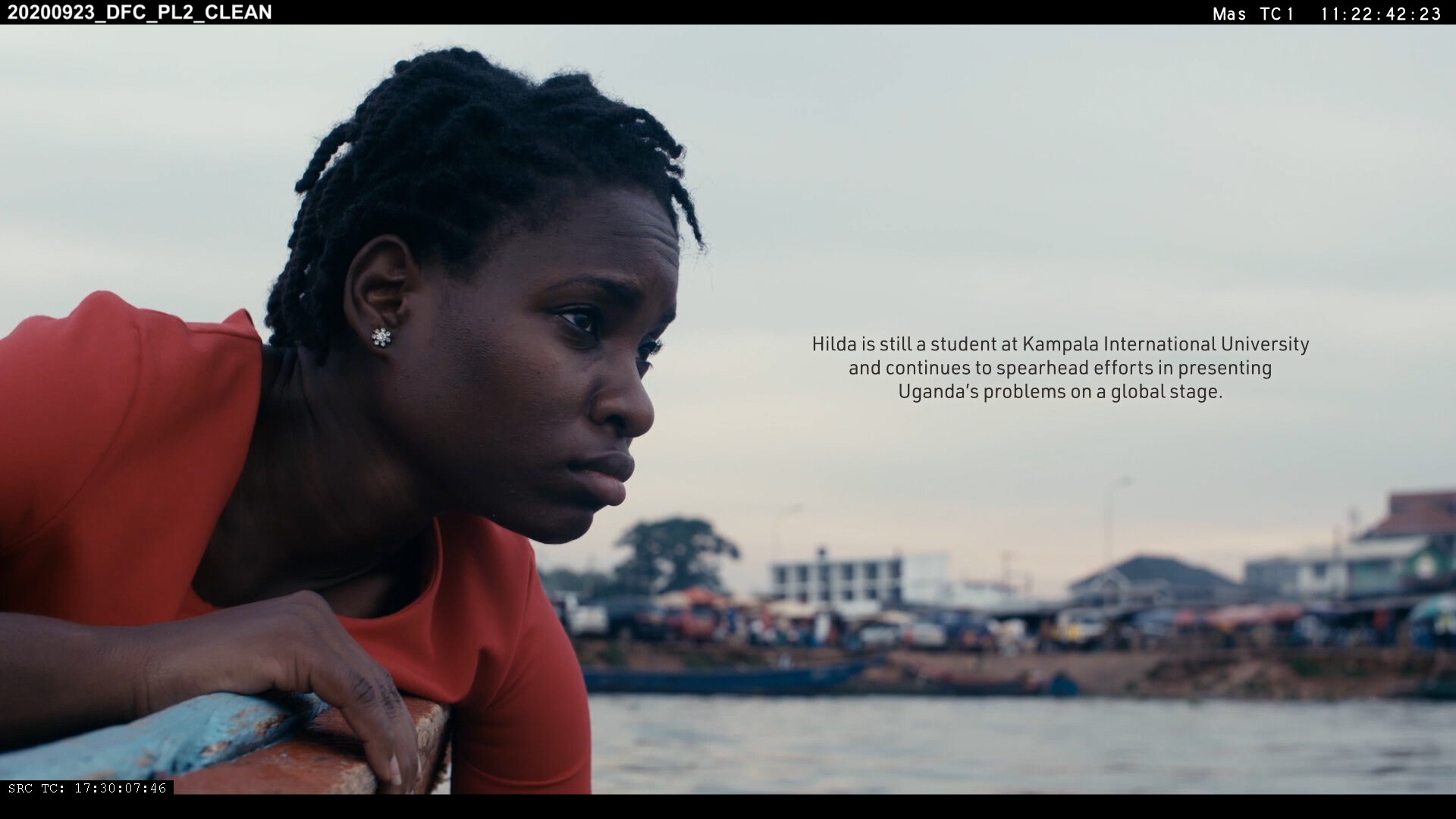
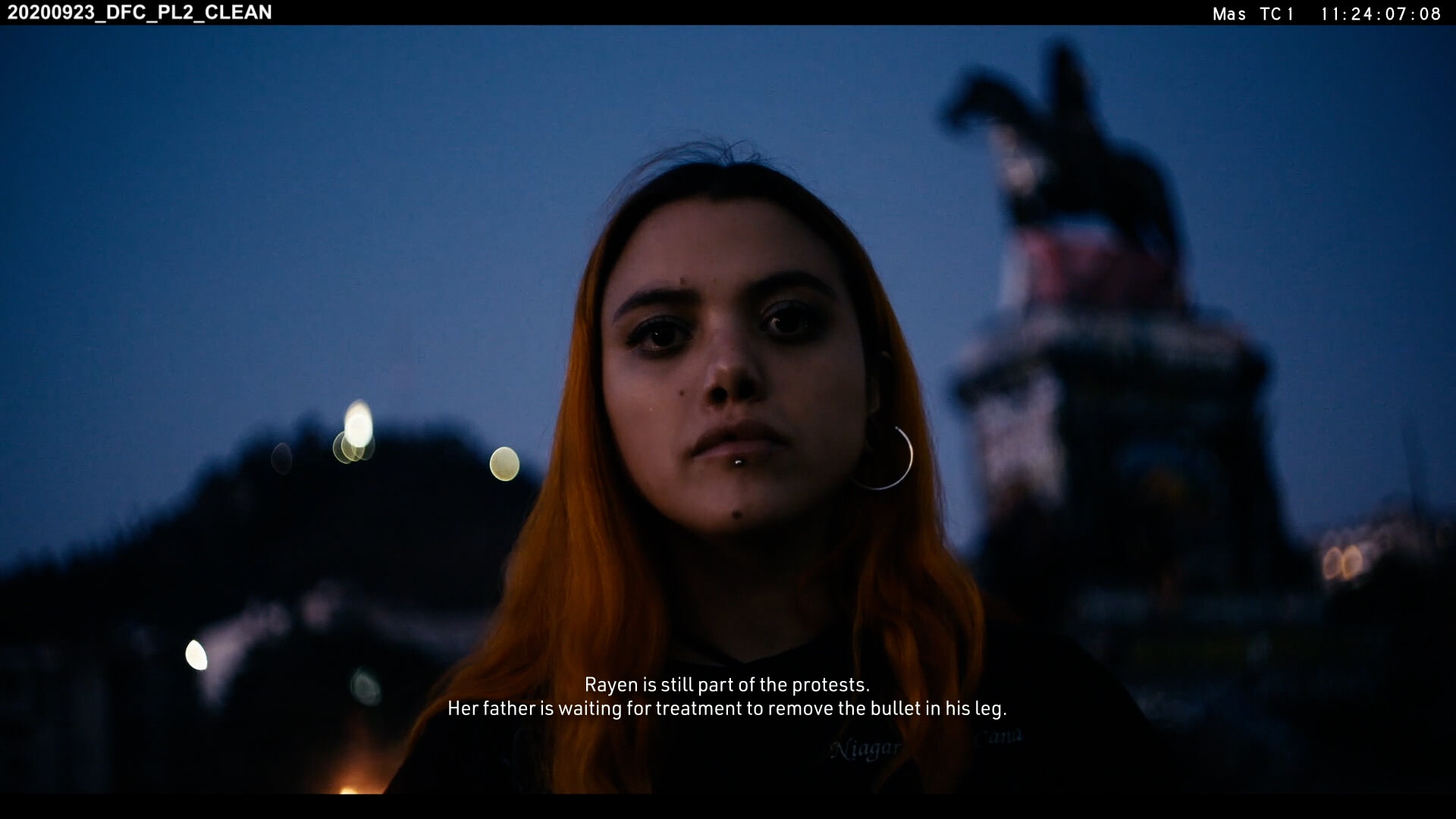
Dear Future Children is a documentary about the new generation bringing attention to topics which have been under-reported for too long. The film explores the impact of activism on their own lives and their personalities and explores the challenges of activism and the motivation of why they keep going nevertheless.
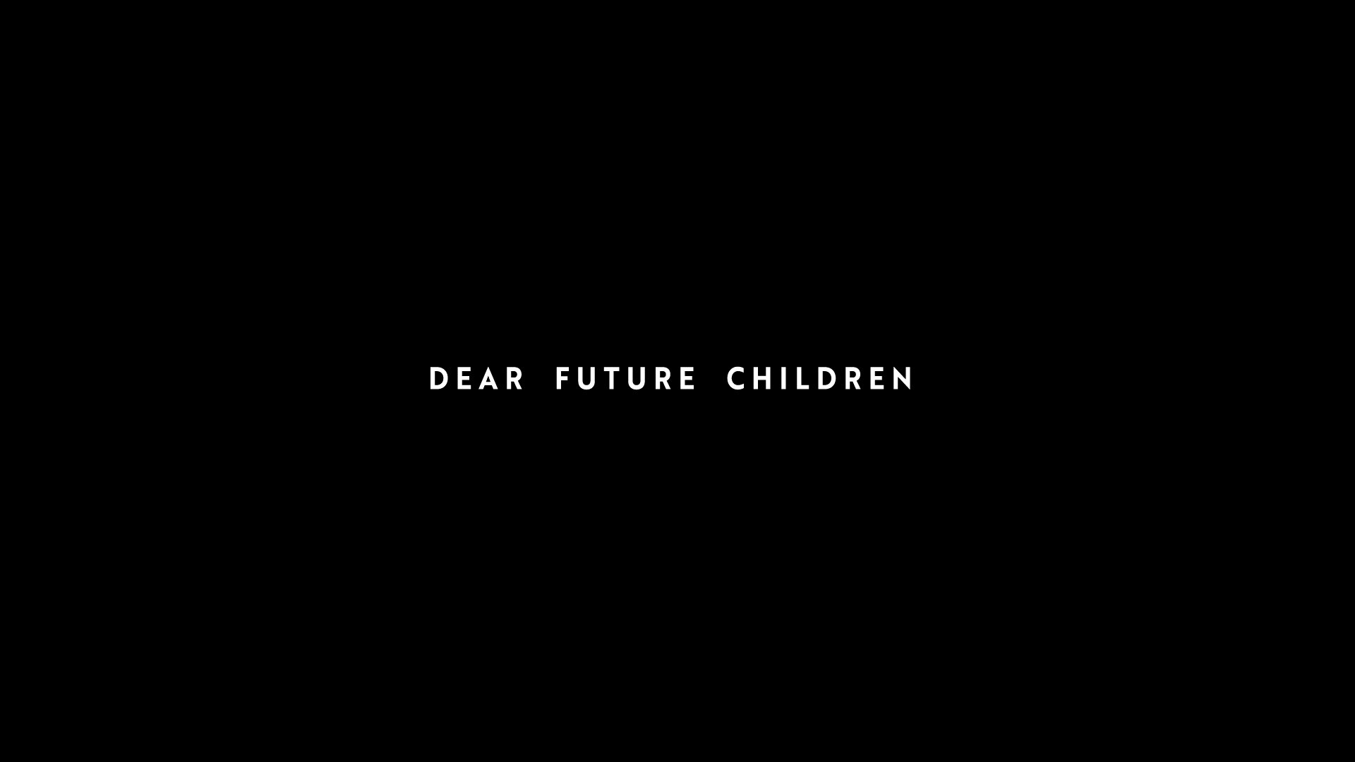
I had the pleasure to work on the titles for this award-winning documentary, where the titles serve the information given. Also, they were looking for a serious, yet stylish font to deliver their message.
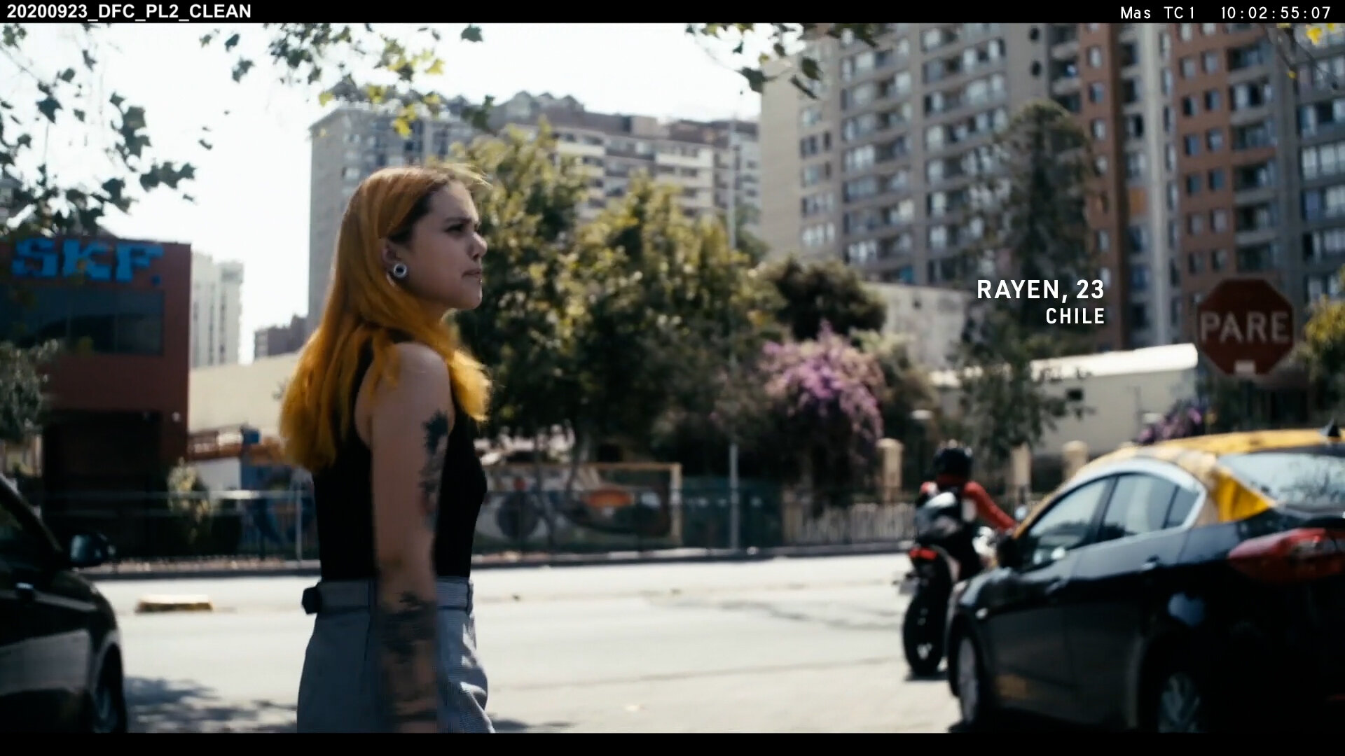
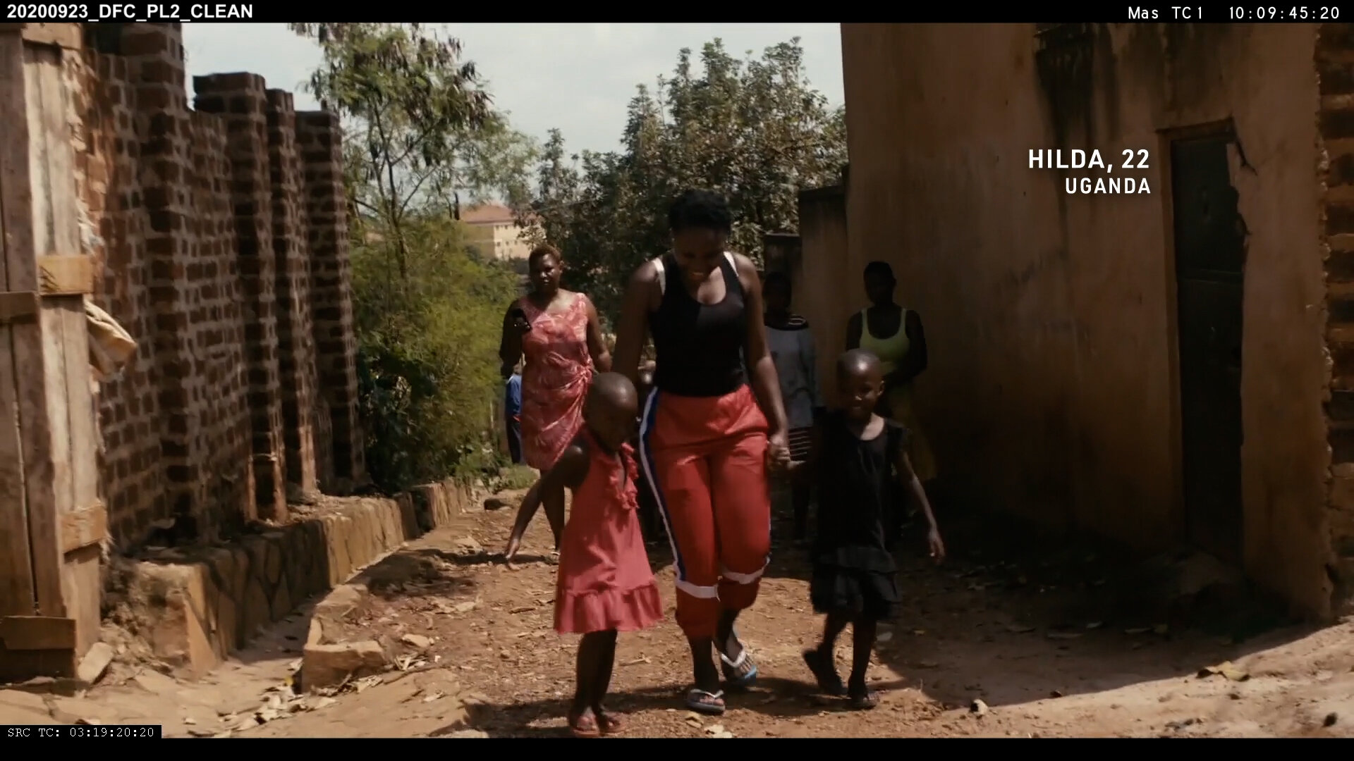
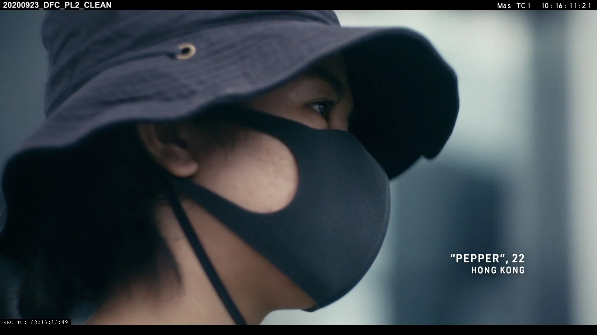
Note - The images displayed may not necessarily reflect the final product. The scenes were not colour graded by the time the graphics were created.


The creation of the assets was quite straight forward and I worked closely with the director, Franz Böhm, whose feedback was highly valuable.
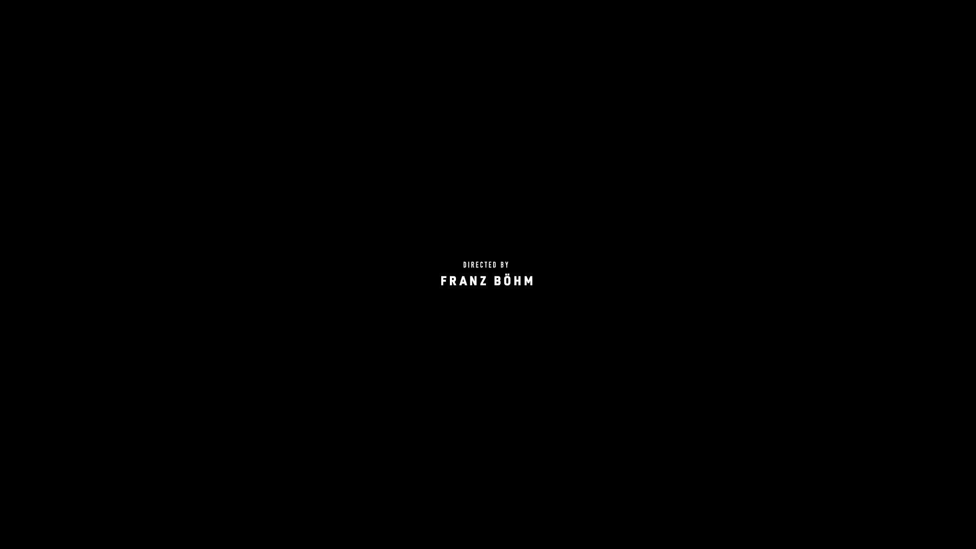
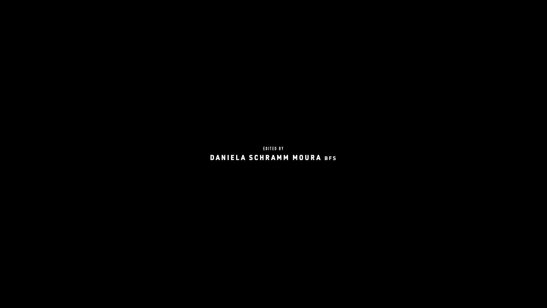
My process, as usual, was to supply different font design ideas that I think would work with the picture and the background allocated. Although normally the Main Title has a different design than the rest of the graphics, It’s important that this is consistent throughout the film. This is why I personally don’t recommend using more than two different fonts when creating titles (unless otherwise stated).
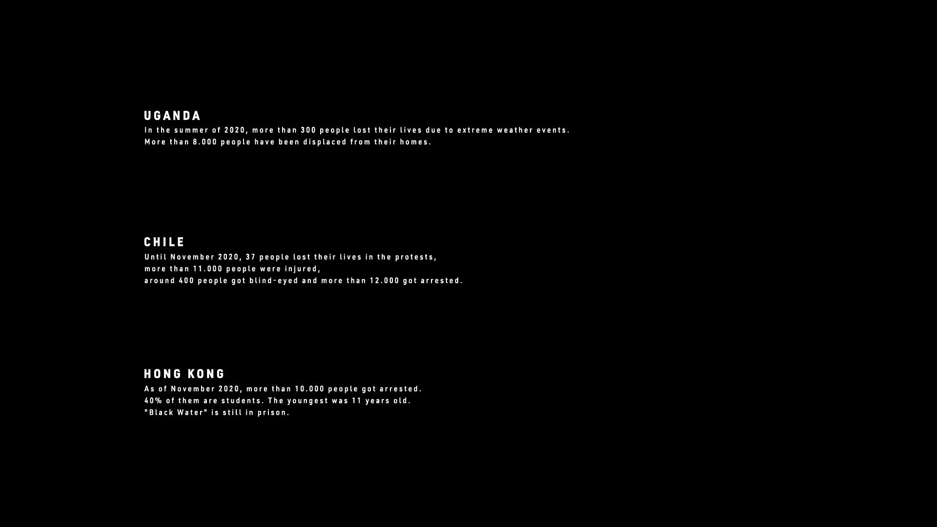
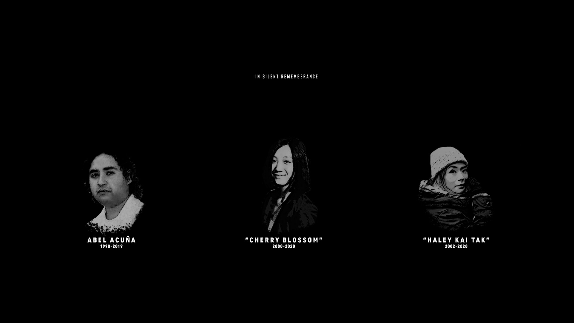
As you can see in the examples above, the on-screen graphics are end credits use the same font. The way to make them look different is by playing with size, thickness, and, most importantly, the layout.
The following pictures are some ideas shown in the early stages of the process: